Role: UX & UI Designer
Brand: Redbox
Timeframe: 2022/23
INTRODUCTION
Project Overview
The Goal

My Role
Before

After
RESEARCH
User Interviews
• Members appreciate the content variety but desire a more personalized experience.
• Members emphasize the importance of being able to redeem their points On Demand.
• Members expressed concerns about not knowing their points balance or forgetting to redeem.
Competitive Analysis

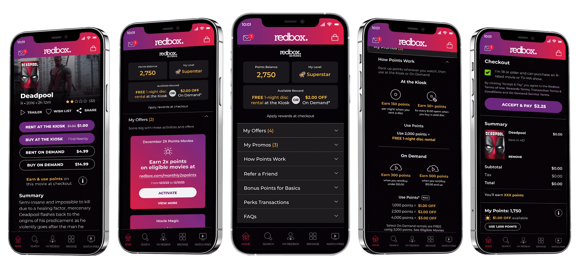
I analyzed loyalty reward programs across other industries, since no other streaming service offers points. The rewards programs that were more user friendly had a higher success rate of redemptions. Simplicity and ease of use are critical for success. Transparency in earning and redeeming points is essential to build trust therefore the balance should displayed across the experience so user is always aware of points they already earned or have potential to earn on their transaction.
Ideation
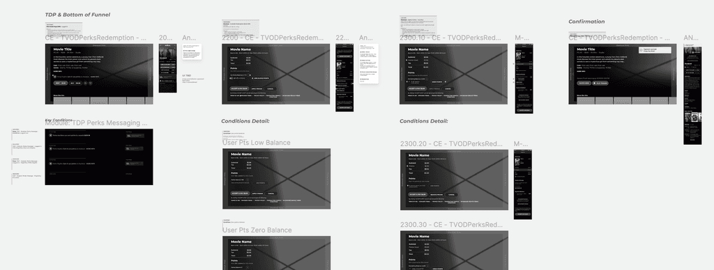
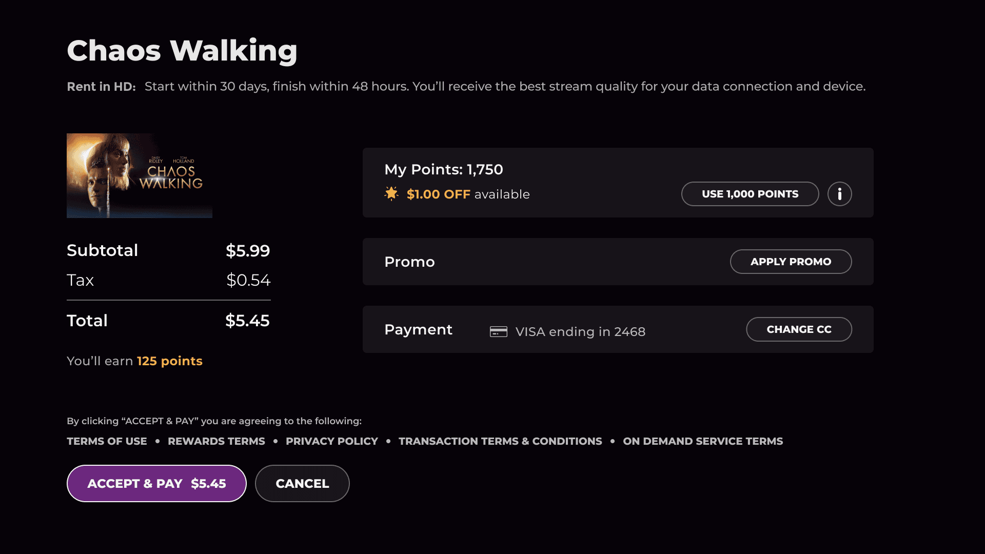
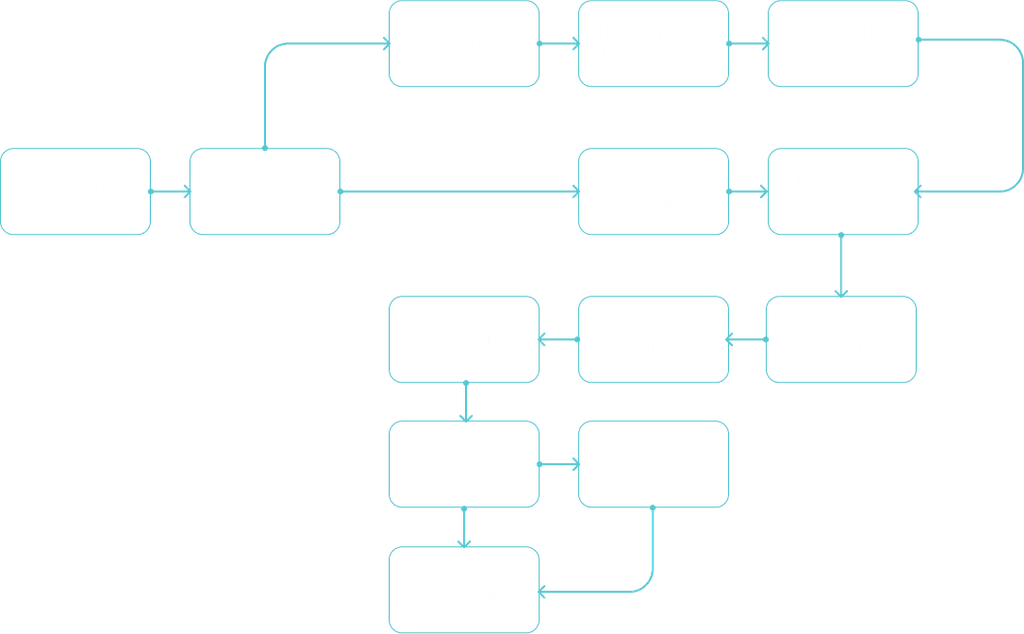
At the wireframe stage, we established and approved the scope and behavior of all the needed screens with developers, PMs and stakeholders. Some decisions were already made at that stage. For example, the scope was limited to reduce dev effort by using more general terms and reducing the number of conditions. Title Details Page through checkout flows have been heavily informed by multiple rounds of UXR. Users strongly desire to have the “ability to see if they have enough points” at TDP, especially if a title is called out as FREE. I’ve done my best to meet those needs & expectations with copy, flow, and features.
Task Flow
DESIGN
Design Process
Before

After
Prototypes
Once the designs were finalized, I created several prototypes that allowed stakeholders and users to interact with the product to allow implementation of tweaks or updates from feedback before the launch.
Usability Testing
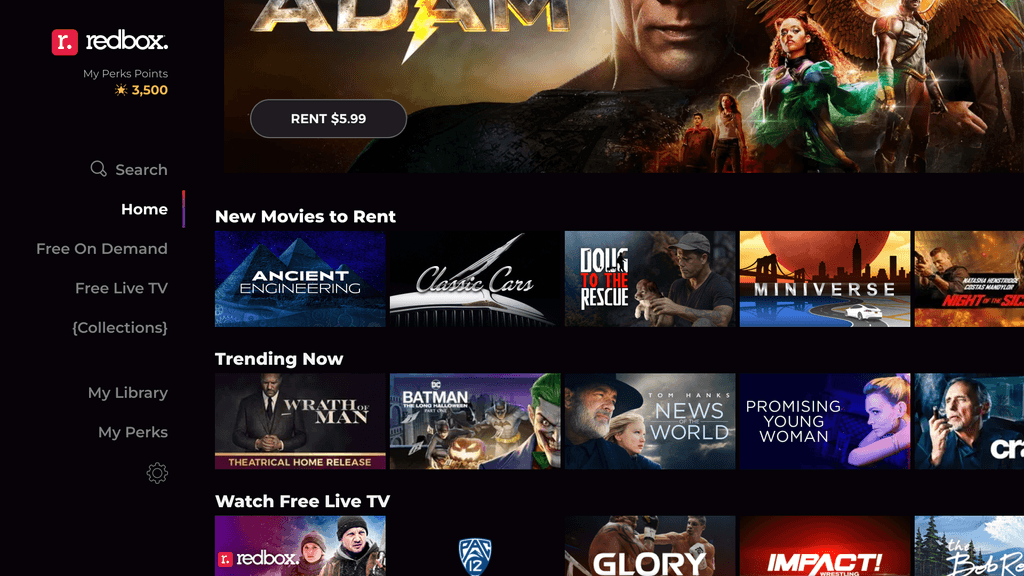
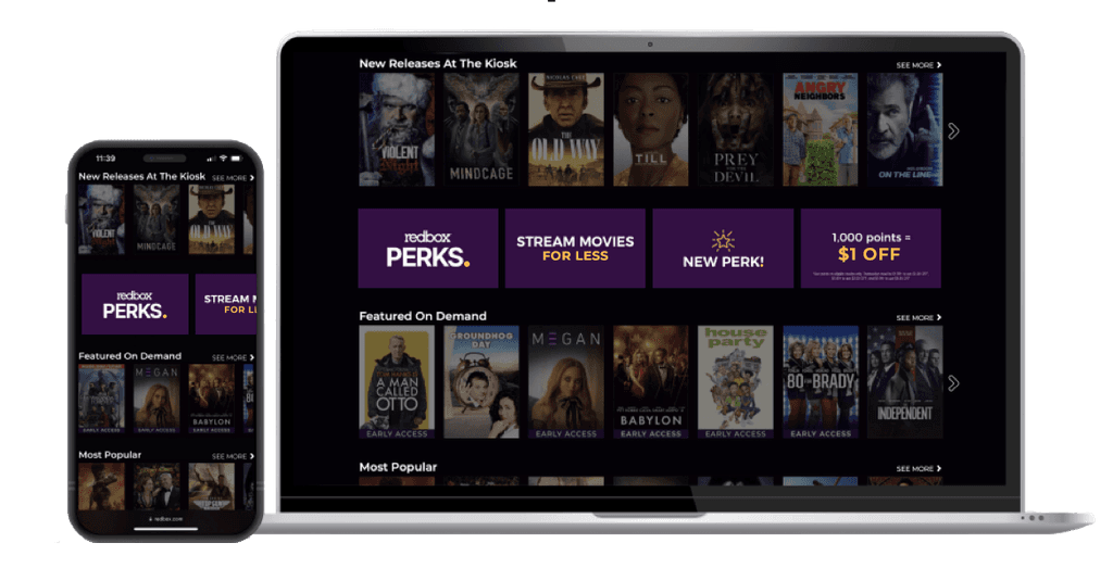
The Perks messaging was noticeable across all platforms. Mobile messaging approach was better understood. Initially the TV App had some comprehension issues. The content included a cost reference "...save $2 with Perks points..." which could have been misconstrued as a tailored message regarding a points balance for some members, especially when briefly scanning the text. The revised and more generic text was significantly more effective and eliminated any user misunderstanding.
development phase
Implementation
Launch
Marketing Campaign
evaluation
Key Metrics
Results


